
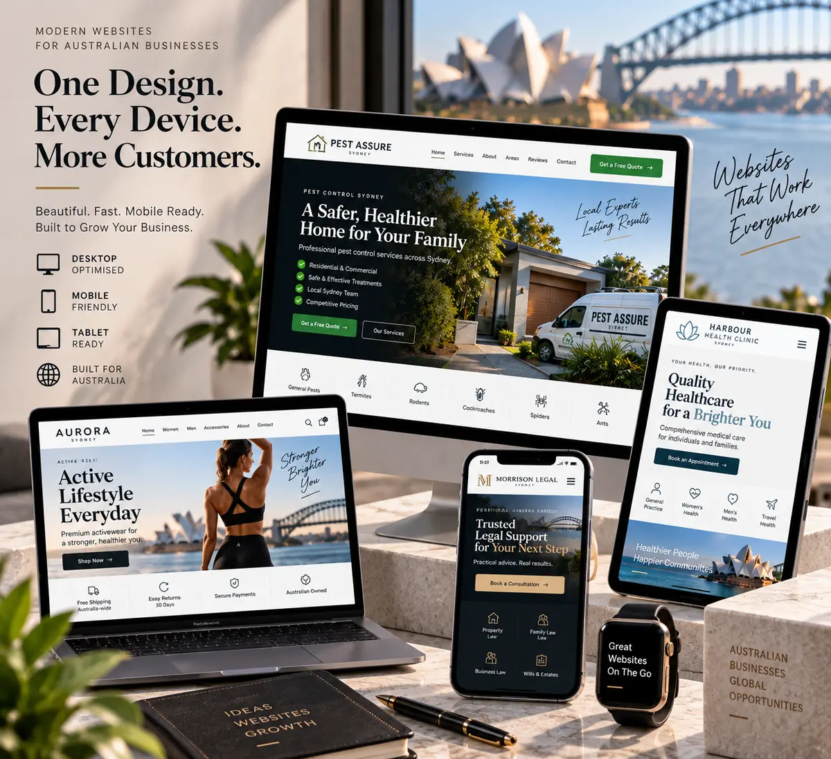
Most small business sites lose people in the first ten seconds
Someone taps your listing from a Google search on their phone. They are deciding three things very quickly: is this the right kind of business, does it cover my suburb, and can I trust it enough to call. A site that opens with a stock photo and the word welcome answers none of those, so they go back to the results page and tap the next one.
Design work here is not decoration. It is deciding what goes above the fold, which service gets its own page, where the phone number sits on a small screen, and how someone who has never heard of you gets to “yes” without reading six paragraphs.
What a WEBSYD site is made of
- A home page that states the job. What you do, where you do it, and how to start — visible without scrolling, on a 360 px phone screen.
- A page for each service you actually sell. Separate pages can rank separately, and they let you answer the specific questions that come with each service.
- Service areas written out. The suburbs you cover, in plain text, because that is what people add to their searches.
- Proof where the decision happens. Photos of real work, licence numbers, insurance, reviews you have actually received — placed next to the call to action, not buried on an about page.
- One obvious action per page. Call, request a quote, or send the form. Not all three competing for attention.
- Structure search engines can read. One H1, sensible headings, internal links, titles and meta descriptions written per page rather than generated.